Waddle’s Pregnancy Creative Direction + Brand Strategy
Role: Brand Strategy, Brand Identity, Logo, Packaging Design, Social + Marketing Concept
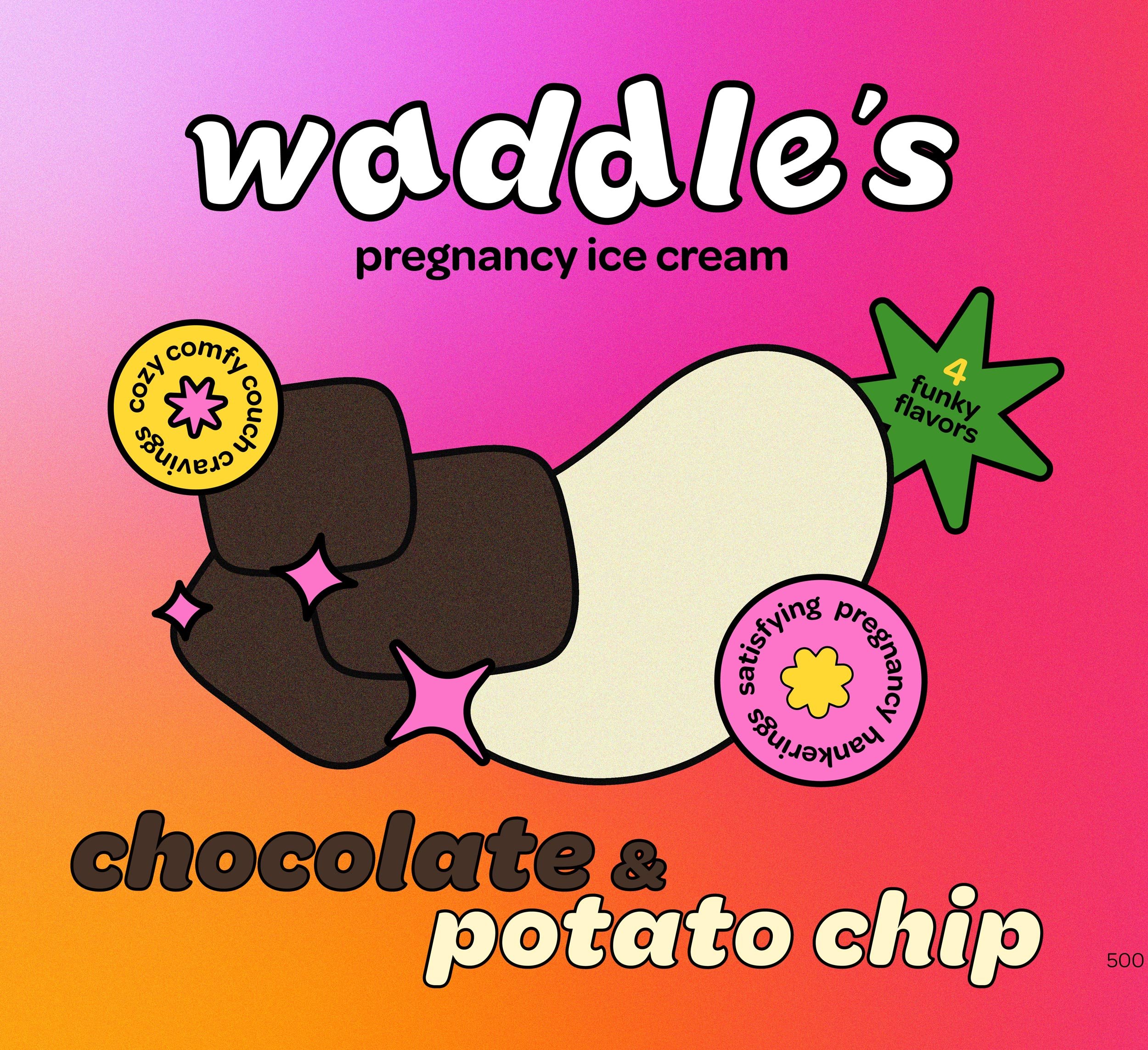
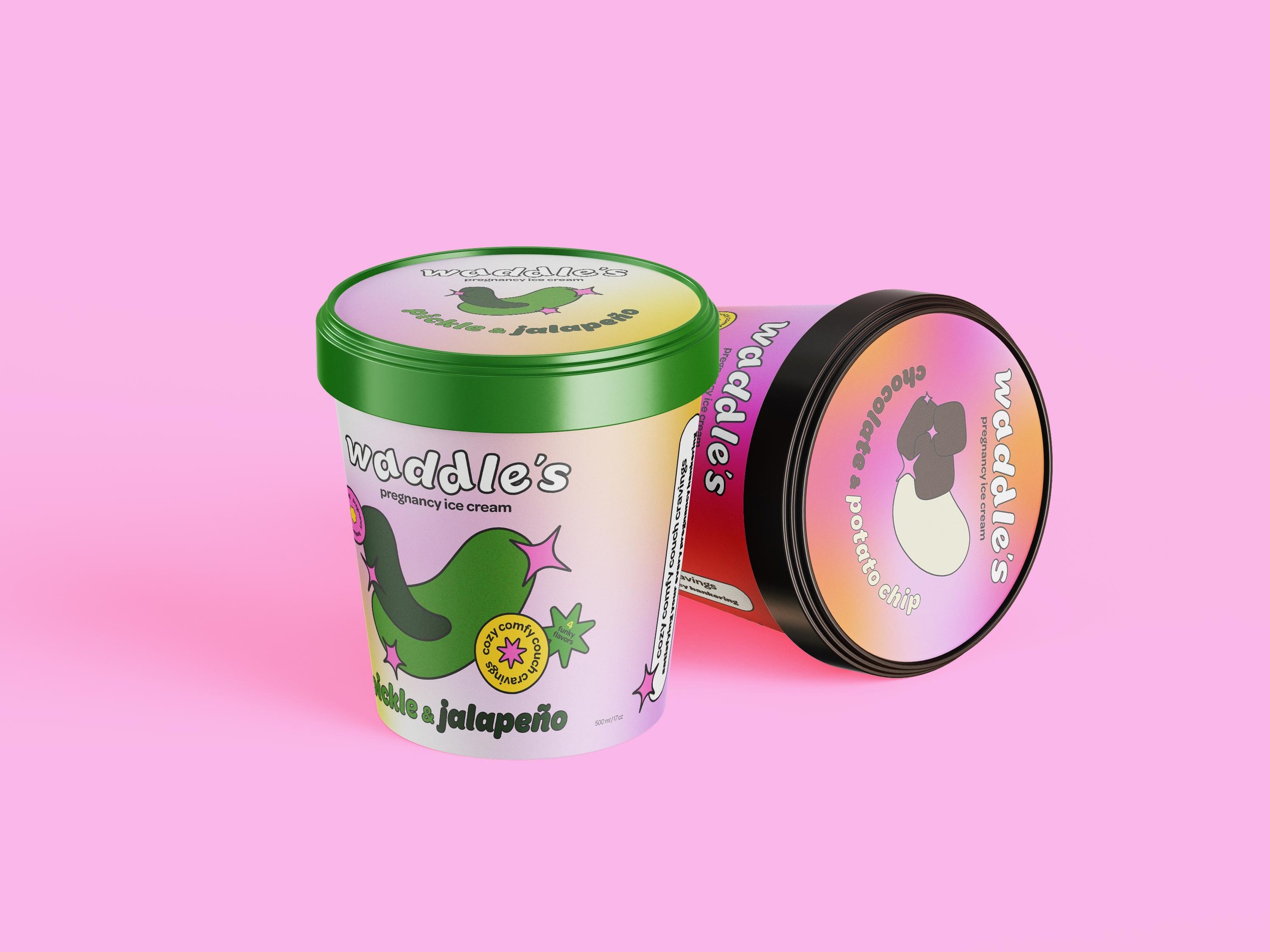
The idea for Waddles came from my own experience: I was pregnant with my first son, consumed by both ice cream cravings and the kind of odd flavor combinations that pregnancy is known for. I saw a real audience being overlooked and built a full brand around it, an ice cream company centered entirely on the strange, specific cravings of pregnancy: pickles and jalapeños, chocolate-covered potato chips, the combinations that sound wrong until you're the one craving them.
I defined the target audience as millennial moms and let that decision drive every part of the brand. The aesthetic leans into Y2K, the visual language this audience grew up on, so the brand would feel nostalgic and familiar rather than generic. The logo carries the idea furthest: I rotated the lettering to create a side-to-side waddle, a direct nod to the way many women walk in their third trimester. It's a detail built from lived experience, and it's what makes the brand feel specific rather than borrowed.
I took the concept from name to full brand system: identity, packaging, social content and marketing materials, all built to carry the same voice and point of view across every touchpoint a customer might encounter.
This identity and packaging was created in Adobe Illustrator.